
How to Choose the Right Countertop Color for Your Kitchen

Walk into any countertop showroom in Sandy, Draper, or Murray and you'll see hundreds of samples. White quartz with gray veining. Warm cream quartzite with gold movement. Charcoal black granite with crystalline sparkle. Cool blue-gray surfaces that photograph beautifully. Warm beige slabs that feel like natural limestone.
Most homeowners leave overwhelmed.
The problem isn't the number of options — it's the absence of a decision framework. Countertop color selection feels subjective because it involves aesthetics, but it's actually quite systematic when you understand the variables. Get the framework right, and the decision becomes straightforward. Get it wrong, and you'll be living with a countertop that fights everything else in your kitchen for the next 20 years.
This guide gives Utah homeowners a practical, step-by-step approach to making the right countertop color choice.
Quick Countertop Color Selection Guide
- Match countertop undertones with cabinet undertones.
- Evaluate samples inside your own kitchen.
- Test colors under morning and evening lighting.
- Medium warm neutrals offer the best resale value.
- Never choose a countertop based only on showroom lighting.
Why Countertop Color Is the Most Consequential Kitchen Decision
Countertop color affects more of the kitchen's visual system than any other single choice. The countertop covers more surface area than the backsplash. It's at eye level from adjacent rooms. It interacts with cabinet color, backsplash tile, flooring, hardware, and wall paint. And unlike paint, you don't change it casually — it's a 20-year decision with significant associated cost.
Selecting the wrong countertop color doesn't just mean a surface that doesn't look quite right. It means a kitchen where every other element is fighting the countertop — where the backsplash that would have looked perfect looks slightly off, where the cabinet color that seemed ideal creates visual tension at the countertop interface, where the whole design doesn't quite come together without anyone being able to articulate exactly why.
Getting the countertop color right, on the other hand, makes every other design decision easier. It establishes the tonal foundation the kitchen is built around.
Start with What's Already Fixed
The first step in countertop color selection isn't looking at countertop samples. It's cataloguing everything in the kitchen that is already decided and cannot change without significant additional expense.
Fixed elements to identify first:
- Cabinet color and finish — if cabinets are being replaced as part of the remodel, this is a parallel decision, not a fixed constraint; if cabinets are staying, this is the primary fixed element
- Floor material and color — hardwood, tile, or LVP that's staying
- Appliance finish — stainless, matte black, paneled, or white
- Lighting fixture finish — pendant lights and hardware finish already committed
- Adjacent space colors — if the kitchen opens to a living area, the visual connection between spaces matters
Once you've identified every fixed element, you can select countertop color based on what will work with all of them, rather than selecting in isolation and hoping everything else works.
This is the most common mistake: selecting a countertop in a showroom under showroom lighting without any of the surrounding elements present for comparison. A countertop that looks perfect next to the showroom's white display cabinets may look entirely wrong next to your warm-cream painted cabinets at home.
Most Common Countertop Color Mistakes
- Choosing under showroom lighting only.
- Ignoring cabinet undertones.
- Buying small samples instead of viewing full slabs.
- Choosing trends instead of timeless colors.
- Ignoring resale value.
Understanding Undertones — the Invisible Factor
Undertones are the most misunderstood aspect of countertop color selection, and misreading them accounts for the majority of "it looked different in the showroom" problems.
What undertones are: Every color has a base tone — warm (leaning yellow, red, or orange) or cool (leaning blue, green, or purple). A "white" quartz countertop may have warm undertones (appearing creamy or slightly yellow in certain light) or cool undertones (appearing almost blue-gray). A "gray" countertop may have green undertones that become visible next to cabinet colors that don't share that undertone.
Why this matters for cabinet pairing: Undertones must agree between your cabinets and countertop. Warm-toned cabinets paired with cool-toned countertops create subtle visual tension that makes the whole kitchen feel slightly "off" — even when both elements are high-quality. Warm paired with warm, cool paired with cool: the agreement principle.
How to identify undertones:
- Hold a pure white sheet of paper next to the countertop sample. If the countertop looks slightly yellow or cream beside the paper, it has warm undertones. If it looks slightly blue or gray, it has cool undertones.
- Place the countertop sample next to your cabinet door sample under natural daylight. The undertone relationship will be immediately visible.
Contractor Insight: Experienced countertop fabricators often recommend bringing cabinet doors and flooring samples when selecting stone because small undertone differences become much easier to identify in person than under showroom lighting.
Light vs. Dark Countertops: What Each Does to a Space
Before getting into specific cabinet combinations, understanding what light and dark countertops do to kitchen perception helps establish the right starting direction.
Light countertops (white, cream, light beige, soft gray):
- Open smaller kitchens visually
- Reflect light, brightening the space
- Show water spots and smudges more readily on polished finishes
- Create seamless transitions in white or light-cabinet kitchens
- The dominant choice in Utah's mid-range and upper-mid-range markets
Dark countertops (charcoal, black, deep brown, dark green):
- Add visual weight and drama
- Work best in kitchens with substantial natural light or well-planned artificial lighting
- Hide minor smudges and water spots better than light surfaces
- Create high contrast when paired with white or light cabinets — striking but demanding
- Growing in prevalence in Utah's higher-end market as design sophistication increases
Medium-tone countertops (warm beige, greige, taupe, medium gray):
- The most forgiving color category — work with the widest range of cabinet colors
- More visually stable across different lighting conditions than very light or very dark options
- Often the safest choice for homeowners uncertain about the light/dark decision
- The dominant countertop palette direction in Utah as of 2026
Countertop Color Pairings at a Glance
| Cabinet Color | Recommended Countertop | Avoid |
|---|---|---|
| White | Warm White Quartz | Cool Blue Gray |
| Gray | Greige | Wrong Undertones |
| Navy | Warm White | Cool Gray |
| Wood | White Quartzite | Matching Dark Brown |
| Sage Green | Cream Quartz | Blue Gray |
Best Countertop Colors for White Cabinets
White cabinets are the most common cabinet color across the Wasatch Front, which means the white-cabinet countertop pairing is also the most often-executed — and the most often executed incorrectly.
The best-performing pairings:
Warm white or creamy quartz with subtle veining — the classic choice that consistently delivers. A warm white countertop with soft gray or gold veining allows white cabinets to read as intentional rather than stark. The key: ensure the white undertone of the countertop agrees with the white undertone of the cabinet. Cool-white cabinets with warm-cream countertop is one of the most common undertone mismatches in Utah kitchens.
Warm gray or greige — adds tonal variation and grounds the all-light palette. Works particularly well in South Jordan and Draper kitchens with substantial natural light where the countertop's warmth balances the brightness of the overall space.
Calacatta-look surfaces (white with dramatic gray or gold veining) — adds design interest and visual movement to white cabinets without introducing a second color. The veining does the work of making the kitchen feel layered rather than flat.
What to avoid with white cabinets: Cool blue-gray countertops that share no warm undertone with the cabinets. The combination photographs well but can feel institutional in person. Also avoid very dark countertops with white cabinets unless the kitchen has exceptional natural light — the contrast is beautiful in theory but can feel oppressive in smaller or darker kitchens.
Best Countertop Colors for Gray Cabinets
Gray cabinets require the most careful countertop color attention because gray comes in more undertone variations than any other cabinet color.
First, identify your gray's undertone:
- Cool gray cabinets (blue-gray, silver-gray): These pair with cool-toned countertops — white with slight cool veining, light cool gray, or warm cream that provides deliberate contrast without creating undertone conflict.
- Warm gray cabinets (greige, mushroom gray, warm taupe): These pair with warm-toned countertops — warm white, cream, beige-gray, or earthy quartzite tones.
High-performing pairings for gray cabinets:
- White quartz with soft movement — the contrast is clean and reads as premium
- Warm cream quartzite — adds warmth and natural character that prevents cool gray cabinets from feeling cold
- Medium greige countertop with a gray cabinet — tone-on-tone that works when there's enough value contrast between cabinet and countertop
Best Countertop Colors for Navy, Green, and Deep-Tone Cabinets
Two-tone kitchens with deep lower cabinet colors are among the fastest-growing design choices in Utah. The countertop — typically on the island and lower runs — has to work with the deep cabinet color while staying coherent with the upper cabinet color and backsplash.
For navy lower cabinets:
- Warm white or creamy quartz is the strongest pairing — the warmth prevents the navy-white combination from feeling cold or nautical
- Light quartzite with gold veining creates a high-end natural stone contrast
- Avoid cool-gray countertops with navy — the combination is tonal conflict without enough contrast to be intentional
For sage green or forest green lower cabinets:
- Warm white with subtle warm veining is the most harmonious pairing
- Cream or warm beige creates a softer, organic kitchen aesthetic
- Light natural wood countertop (butcher block island only) on a secondary surface adds contrast
For charcoal or deep brown lower cabinets:
- White creates a dramatic high-contrast look that works in kitchens with substantial light
- Warm cream is more forgiving in medium-light kitchens
Best Countertop Colors for Wood-Tone Cabinets
Natural wood and wood-look cabinets have seen a significant resurgence in Utah kitchens, particularly in the mountain modern aesthetic common in Park City, Holladay, and east bench Salt Lake City communities.
Pairing principles for wood-tone cabinets:
- Match the undertone temperature of the wood — warm honey-toned wood pairs with warm-toned stone
- Lighter countertops provide necessary value contrast against wood tones that can read as dense
- White quartzite or white marble-look quartz against medium-dark wood creates the layered natural material palette central to mountain modern design
Strong pairings:
- Bright white quartz against walnut or dark oak cabinets
- Warm cream quartzite with white oak or maple cabinetry
- Honed white marble-look granite against natural hickory or light wood tones
How Natural Light in Utah Homes Affects Countertop Color
Light conditions in Utah are distinct. The combination of high elevation, low humidity, and strong sunshine from the west produces light that is brighter and more golden in the afternoon than in most coastal markets. This affects how countertop colors read at different times of day.
Practical implications:
- Countertop samples should always be evaluated in the actual kitchen space, not just a showroom, before final commitment. Bring large samples home.
- West-facing kitchens in Herriman, Riverton, and South Jordan receive intense afternoon light that will warm any countertop color significantly. A neutral warm-gray countertop can read almost yellow in west-facing late afternoon light. A very cool countertop can look balanced in the same conditions.
- Mountain reflections and snow: In winter, snow reflection can cast a cool, bluish light into your kitchen, while summer mountain reflections can cast green or earthy tones. Testing samples across seasons or simulating these lights is beneficial.
- High UV exposure: Homes with large panoramic windows or newer west-facing developments face extreme UV exposure, making UV-stable materials crucial to prevent yellowing.
- North-facing kitchens lose natural light and need countertops that reflect rather than absorb — lighter surfaces are strongly recommended.
- Basement kitchens and kitchens in Utah's older bungalow stock in Murray, Midvale, and Millcreek with smaller windows need countertop colors that maximize perceived brightness.
The sample test: Get a minimum 12x12 inch sample of your top two or three countertop choices. Place each in the kitchen at different times of day — morning, afternoon, and under artificial evening lighting. The right choice will work across all three conditions, not just one.

Veining: How Much Is Too Much?
Veining — the linear movement of color through stone — is one of the most consequential countertop design decisions after base color. It's also highly personal. The right amount of veining depends on the surrounding design context and the homeowner's visual preferences.
Minimal veining (very subtle movement or no veining):
- Creates a clean, calm surface — good for kitchens with other high-visual-interest elements (patterned backsplash, bold cabinet color, dramatic lighting)
- Easier to maintain visual consistency across multiple slabs in large kitchens
- Lower resale risk — minimal veining reads as timeless rather than trendy
Moderate veining (soft, flowing movement):
- The most popular choice in Utah kitchens across all price tiers
- Provides visual interest without dominating the space
- Works with most cabinet colors and backsplash options
- Quartz options in moderate veining are consistent slab-to-slab; natural stone veining varies
Dramatic veining (bold, high-contrast movement across the full slab):
- Strong design statement — the countertop becomes the focal point of the kitchen
- Requires restraint elsewhere in the design (simpler backsplash, quieter cabinets)
- Best applied to island surfaces where the full slab can be appreciated
- Quartzite and natural stone in this category: every slab is unique; selecting slabs in person is essential
How Countertop Color Affects Maintenance
Beyond aesthetics, your countertop color dictates your daily cleaning experience. Very dark, polished countertops show fingerprints, dust, and water spots almost immediately. Very light, solid-colored surfaces easily reveal crumbs and soap residue. For the lowest daily cleaning visibility, medium-toned countertops with subtle veining or speckling (like a mid-tone granite or warm greige quartz) are the most forgiving, hiding minor messes and keeping your kitchen looking pristine with less effort.
How to Use Samples Before You Commit
The single most impactful step in the countertop selection process is bringing samples home before purchasing. Most reputable countertop suppliers in the Wasatch Front market will provide large samples (12x12 inch minimum) for in-home evaluation.
The in-home sample evaluation process:
- Place the sample on the actual countertop surface — not the floor
- Evaluate under morning light, afternoon light, and evening artificial lighting
- Hold the sample against your cabinet door at countertop height
- Place the sample next to a tile or backsplash sample if backsplash is already selected
- Live with the sample for 48 hours before deciding
The importance of slab selection for natural stone: If you're selecting quartzite, granite, or marble, request to select your specific slab at the fabricator's yard, not from a small sample. Samples show the general character of the material; the specific slab shows the actual veining, color movement, and texture of the stone going into your kitchen. Slabs within the same material name vary significantly — two "Taj Mahal quartzite" slabs from the same lot can look noticeably different.
Countertop Color and Resale Value in Utah
For homeowners in the Wasatch Front market who plan to sell within 5–10 years, countertop color selection has a resale dimension worth understanding. Neutral countertops appeal to a broader range of buyers in Utah because resale value is influenced by versatility rather than trends. A warm white or greige countertop acts as a blank canvas, allowing future buyers to envision their own style without feeling the need to immediately renovate.
What performs best for resale:
- Neutral to warm-neutral tones — white, cream, warm gray, and greige countertops consistently outperform in buyer evaluations across all Utah market tiers
- Moderate or no veining — dramatic veining is beautiful but personal; buyers who don't share the aesthetic will mentally discount it
- No strongly trendy colors — charcoal black, emerald green, and bright pattern countertops are striking but segment the buyer pool
What to avoid if resale is a priority:
- Highly personalized color choices — very dark, very colorful, or dramatically veined countertops narrow the buyer pool
- Color choices that date to a specific era — there are countertop colors from the 1990s and 2000s that immediately communicate age to buyers
The safe zone: Any mid-tone warm neutral in white, cream, warm gray, or greige territory from a major quartz manufacturer or a mid-range natural stone selection will perform well for resale in any Utah market tier.
Countertop Color Checklist
- ✓ Cabinet undertones verified
- ✓ Flooring considered
- ✓ Lighting evaluated
- ✓ Samples tested at home
- ✓ Veining selected
- ✓ Resale considered
- ✓ Family lifestyle considered
About the Author
Marisa Batista Moreira
Managing Editor | Content Operations Manager at Alta Home Group
Marisa covers countertop materials, kitchen design, and home improvement strategy for Alta Home Group. She writes practical guides that help Utah homeowners make decisions with lasting impact — understanding the material science behind countertop choices, the design principles behind color selection, and the installation details that determine long-term performance. Her countertop content is consistently informed by what contractors and fabricators working across the Wasatch Front observe in real-world selection and installation outcomes.
Schedule Your Free Countertop Consultation
Alta Home Group works with trusted Wasatch Front professionals to help Utah homeowners find the right countertop material, color, and finish — and install it correctly. We handle Kitchen Remodeling, Cabinet Installation, and more. Free consultations, no commitment required.
Request your free countertop consultation →Related Articles
View All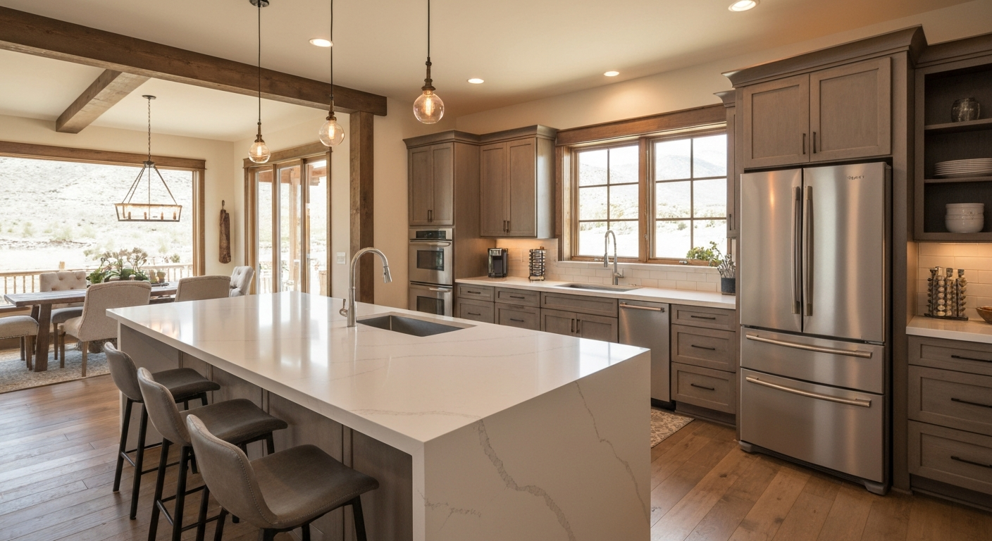
Quartz vs. Granite: Which is Best for Utah Kitchens?
An in-depth comparison of durability, maintenance, and aesthetics to help you choose the perfect countertop material for your home.
How to Choose the Best Countertop Material for Your Home: Granite vs. Quartz vs. Marble vs. Quartzite
Granite, quartz, marble, or quartzite? This complete guide compares durability, maintenance, cost, and lifestyle fit — so Utah homeowners can choose with confidence.
Best Countertop Materials for Busy Families
Choosing countertops for a family kitchen means balancing durability, maintenance, and budget. Here's what actually holds up in real Utah households.